In what ways does your media product use, develop or challenge forms and conventions of real media products?
The media product that our group created was based around the song, Way Back into Love, we created a generic music video and two ancillary texts for this love song. The music video and ancillary texts demonstrate typical characteristics of the love song genre for example the young couple performing a duet is very romantic. We had the characters singing to each other is very typical in a love song, a music video that follows similar characteristics is No Air by Jordin Sparks. This video has the two performing artists singing directly to each other for a lot of the video. It is important to promote the artist so we included a lot of lip syncing, performing and close-ups as well as creating a narrative structure throughout. The lyrics are about two people wanting to fall in love and this gave us a lot of inspiration for the visuals, for example we presented the characters on the day that they met for the first time and gradually built up a relationship between them. The fact that the couple both woke up alone is very significant in our video because this shows that they need to find love to save them from being lonely. I really like the way our lyrics and visuals interact as it amplifies the meaning and significance of them.
The music and visuals interact very well as the pace of the music is quite slow which is why we made our shots last for quite a long time. I also think that because we let the shots last for a while longer the image of the performer is improved and the impact is heightened as the audience see her lip-synching for longer. The piano at the beginning directly links to what is happening with the music because at the beginning of the song there is a piano solo and we used a piano to open our video. We chose to include this in our video because it makes the performer look talented which will attract an audience, it also sets a mellow tone for the duration of the video. I think that we have created an interesting visual style; all of the colours in our shots are ‘girly’ and mellow, this includes the costumes that the female performer is wearing. The tone that is created by these colours brings out love and loneliness as a theme, we help this along by hinting towards love in some of the shots. We did this by including a cardboard heart which re-occurs throughout; we did this because we wanted to create a motif that would distinguish our video from any other typical love song videos.
We did not make our music video voyeuristic in any way because not only was the music video intended for audiences of all ages but we think that the love and lust was equal between the male and female characters and we wanted to show that the attraction was mutual. We showed the attraction between the two by the motion of the characters looking into each others eyes. We also showed emotion by having close-ups of the character singing into the camera I think this made the video very interesting. Way Back into Love is a song from the film Music and Lyrics however we chose not to have ant intertextual reference to this in our music video because we wanted to include fresh ideas which we created ourselves. Altogether I think that we created a music video that includes the genre characteristics of a love song which means that we achieved what we were aiming for.
How effective is the combination of your main product and ancillary texts?
Our main product and ancillary texts all interrelate, they work well together to promote the artist and entice the consumer. All of our products represent the artist because of the colours and pictures. For example on the front of the digi-pak cover we have pictures of Hayley Bennett that we have edited to look quite abstract and modern. The digi-pak cover that we created on Photoshop was very ‘girly’ and mellow in that the colours were popular ‘girls’ colour. For example we used a lot of purple and baby blue to in the background; I think that this attracts women of all ages because the colours and pictures are subtle. We chose to add hearts along with pictures of the artist because it represents love which represents the song and the video directly. The magazine advert that we created was different to our other products because of the vibrant colours and bold pattern. We chose to make this different because we wanted to attract the audience with the bright colours, red, orange and green. This product still links in with the other two products because it has a silhouette of the artist and it is also quite feminine like the digi-pak and video. I do think that the package as a whole would see well together and apart, I could see all of our products being genuine and professional which is the look we were going for. All of our products represent the artist because of the colours and pictures. For example on the front of the digi-pak cover we have pictures of Hayley Bennett that we have edited to look quite abstract and modern.
What have you learnt from your audience feedback?
We have received a range of audience feedback which not only influence our work but taught us how we could have improved. The first feedback that we received was by our peers and was an analysis of our rough-cut. This was important because we had a chance to edit our video if they pointed out any faults or new ideas; we also had a chance to do some more filming. For this we were analysed on the videos cinematography, editing, mise-en-scene and genre conventions. For cinematography we were told that we had a good variation of shot types and lengths, they expressed that they enjoyed the split screens. However they said that our shots got a bit boring towards the end because they drag on too much. This helped up when we went to film again because we got some more shots so that we could cut down the lengths of the shots. We were then analysed on the editing which we had not yet finished as it was the rough-cut this was very helpful because we had a lot of time to adapt and edit. They said that our synching was very accurate, they also liked the order of shots and the range of transition types. However they said that we had too many fades at the end of our shots, they said that the shots were two long and could use some variation. We took all of this on board and cut down the shots and added some new shots. We did not reduce the amount of fades because personally we liked this effect and thought that our video suited this well.
The other groups also commented on our mise-en-scene saying that the costumes were good and that we had a nice use of location. They said however that we should not use the college in our video. We improved this by filming more away from college making it look more professional. They said that we followed all the genre conventions because it was a typical love song and it was very focused on both the characters. They also liked the hearts in the background of the shots. However they thought that there was no chemistry between the characters which was disappointing so when we re-filmed we tried to improve the chemistry between the characters by making them closer and more intimate. We receive some other feedback on our final video however it was not very detailed. They basically just said that our final product was good and that it had improved since the rough-cut. They liked all of the new shots; they said the piano was very appropriate, they also said that the chemistry had improved to a certain extent. This gave us confidence in our video that we didn’t have before which was needed.
How did you use new media technologies in the construction and research, planning and evaluation stages?
We used many new technologies to create our video and ancillary texts. Internet was played a big part in the planning of our video. We used the website www.blogger.com to record all of our planning, this helped us to gather a lot of information together in one place and really express our ideas to each other. An essential website that we used was www.youtube.com this gave us a lot of inspiration and ideas during our planning stages because we had the opportunity to look at other music videos of the same genre. This was also a useful programme because we posted our music video on here which is nice because we are able to see what the public think of the video we created. The internet in general was useful for our research as we wanted to find our more about the artist and we also wanted to send her a message to tell her that we were creating a video for her song. We did not get a reply which would have been very interesting. Sometimes you can not rely on the internet because it is created by every one and some parts might not be true.
We used the cameras which were quite easy to use however the tripod was quite irritating because it was wonky and we had to find a way around this because we could not film with a wonky camera, we got around this by making on of the legs lower it then turned out we. We used final cut for all of our editing, it is a very sophisticated programme which takes time to get used to but we worked out all of the different techniques and special effects that we needed for our video, so we found a way to make final cut work in our favour and without final cut our video would not have been such a good quality and it would not have been very interesting. We used Photoshop to create our ancillary texts we worked really we with this programme because it helped to create a lot of interesting effects, it made our digi-pak and magazine advert look professional and visually appealing. To communicate with each other we used mobile phones which were very important because we needed to contact each other about filming dates and times and also deadline dates and times. Altogether new technology and equipment was essential in creating our music video.
Friday, 11 December 2009
Evaluation (Cassie)
In what ways does your media product use, develop or challenge forms and conventions of real media products?
Our media product has a variety of different forms and conventions. We did a lot of research and we got most of our inspiration from other music videos. From our research, we managed to find out the different form and conventions of what a typical love song should include. We used this to plan and produce our own music video. A typical love song has lots of close ups of the artist and couple. Our music video has a narrative about a typical couple meeting and falling in love. we used locations that were seen to be everyday locations, this made the video more realistic and conventional. Normally in a love song, the video will be directly linked to the lyrics. The pace of the song should match the pace of the video and this is what we did with ours. The pace of the music video is slow and conforms to a long song. We use a variety of shots and locations to make the video more interesting and to keep the video from getting boring. The use of different shots and lighting sets the mood for the love song and sets the emotion. The song that we chose was Way Back into love by Haley Bennett which is thought of as a typical love song. The song is a duet by Hugh Grant and the lyrics talk about finding love. The video was simple to plan and produce as the genre of the song is well known and there is many ideas that we could use and devlop. Bad Day by Daniel Powter was an inspiration for what we wanted for our music video and we got many ideas from it. No air by Jordin Sparks and Chris Brown helped us to piece together our narrative as well as giving us ideas for editing. We used split screens and slow motion shots which they use in their videos and we thought this was a very good idea. The song we chose, Way back into Love, didn’t have an original music video apart from the movie that it is in, we found it harder to come up with ideas as we had no starting point. we found this challenging as that meant we couldnt get ideas from the origional music video. Our music video contains the romantic couple and they meet and fall in love. This is our narrative. Its suits teh lyrics very well. We have used lots of shots of the artist with a range of lip synching. This is used in other music videos as it makes a signature for the artist. We made our video for all audiences by making it suitable for everyone. We really liked the piano playing from Bad Day by Daniel Powter and thought it would make a good opening sequence. In my own opinion i feel that our music video conforms to the typical conventions of a love song.
How effective is the combination of your main product and ancillary texts?
Our digi-pack was mostly influenced by our music video, song and research of other products. It was made to sell the artist, along with the song and our products had colours that show the colours of love. the products are simple, however they keep the audience interested and wanting to buy the video. we used silhouttes to show the artist but keep her a mystery, this was to keep the audience keen and interested. Our poster gives a new image to the artist showing her as a new star. The silhouette was our main way of doing this. The background was to put the impression accross of the artist being unique and individual. Our DVD cover gives the audience an insight to what the song is about, it has girly images and colours, to show that she is the main singer. The objects we used were things such as roses and hearts. We wanted to attract people to the artist, we did this by using an image of her face but distorting it, keeping that mysterious context. A clear link between our ancillary task and music video was really important. All of our products flow together and this makes the digi pack more interesting and buyable. The main reason for making them all connect is to keep the audience interested in buying the products, if they didnt flow then the buyer would get confused and wouldnt be interested.
What have you learnt from your audience feed back?
All feedback received was taking into consideration and recorded on our blog. We reffered back to it all when it came to our final editing. We took everything said into consideration as we found it very useful in making our video successful. We focused on the feed back when we went out to do more filming. People said that the couple in our msuic video were uncomfortable together, therefore, we filmed most parts again to make sure the couple looked interested, this kept the flow of the video. Also people said that we didnt have a clear narrative, this meant that we had to re think what we had already done and go over it so we had a clear narrative to stop the audience getting confused in what was happening. We filmed a lot of the parts again to keep the continuity. Another suggestion was that we needed more footage of the artist singing this was suggested by Tanya, so we refilmed lots of different angles of the whole song with both artists singing together and separately. We also re filmed the piano part as the piano looked very unprofessional. The change in feedback from out rough cut to our final piece was a big improvement and we took all comments into consideration. Feedback was really helpful as it enabled us to hear what people thought of our music video.
We also had feedback on our ancillary task which was positive. The group liked the simplicity of the products. Overall, our feedback played a big part in the succes of our music video.
How did you use new media technologies in the construction and research planning and evaluation stages?
You tube and access to the internet played an important role in our planning and research. The internet enabled us to gather inspiration for our video. We used blogger on a regular basis to keep a track of whatwe were planning and every stage of our filming, this was to look back at and help us to improve our initial ideas and produce the final piece. We needed itunes to play our song as we filmed and this was important so when it came to editing we would be able to match the lip syncing to the origional song, this was just an easier way and made things more efficient when it came to editing. We also found that a tripod helps a great deal when filming, when we filmed out test footage the camera was wonky and this meant that when we came to do the split screens, the shots didnt match up, this was obviously a big deal when it came to the final piece as everything has to match up or the video looks bad.
We used final cut for all our editing as this is a really godo and easy way of editing a music video, it helped us a lot in the production of our final products.
The rest of our tasks were done on photoshop as we could plave any picture into it and edit it to what we wanted, i think it played an important role in the making of our prducts.
In my opinion , without the new media technologies, we would not be able to produce the things that we did, they are very important when making the products that we did.
Labels:
Cassie
Wednesday, 9 December 2009
Evaluation (Dan)
Looking at our whole media product in general, about romance and love. I can see that the song comes from a Hue Grant film and that the film genre is comedy romance that contains a song A Way Back Into Love, giving our song's genre a romantic love feel towards it. These comedy romance films such as Love Actually have been incorporated into our digi pack and video as the films are like a cheesy romance where characters consistently run into each other time after time until they end up falling in love, We decided to make our narrative to our music video similar to the films where two characters keep meeting and seeing each other until towards the end a climax of the two kissing giving the audience what they wanted, because the type of consumer for this product wants the happily ever after reassurance towards the end and that everything is going to be fine,
It can also be shown in the digi pack, the dvd cover and inside of the are of our main singer Sheridan, these pictures are flat on the background, the pictures are merged so that you can pick out what the pictures are but little pieces of the picture are missing giving a simplistic effect that you don't need all the picture to see whats there giving the idea that you might not see love at first but it is there, In the video we can see that both characters are singing from opposite sides of a tree which gives the impression that its fate for them to meet and or be together also when they do meet different time of the video the audience can see that their is a heart in the background of the scenes for example a heart on the bus stop window where both characters are sitting.
Looking at the magazine add, it is simple and doesn't give to much away, we kept the picture of the artist as a silhouette with a colourful flower background which looks like the flowers are growing, giving the impression that the single within the album which we did our music video on, from the start of the music video where characters wake up alone is when the flower is small and through out the music video the flower grows as the two become closer and closer until the end when they are finally together the flower is fully grown which creates a link between the music video and magazine advert.
Our main product and ancillary text are effective in the way that they create the bond and give the audience an in site towards our ideas and keeps them interested with our simplistic products for example the silhouette of our singer on the magazine cover gives a side of mystery towards the artist as well as the album, consumers will have to buy our products to find out the rest of our product because being simplistic only gives certain parts of our product away, leaving questions; Why is the artist a silhouette? Is she a shadow or herself? which causes excitement to the audience which will then want to buy the product because of interest.
Looking at the dvd cover once again the flat pictures on a background with missing pieces to them allow the audience to see what the dvd album is about but leaves questions again; Why are half the pictures missing? Is something missing from the artists life? once again creating interest in the product.
the Magazine advert doesn't contain much writing once again because of the simplistic idea and keeping consumers interested instead of being bored of our product, so we gave our product distinctive colours such as pink in the magazine and red on the dvd album attracting the audiences attention, drawing them in to the product which makes it very effective to hype the market up and sell lots of albums.
Audience feedback from our peers of our final music video was pointlessly dull, it didn't give us any points to learn from or what went we'll we simply got told what are narrative was which we already knew because we made it, luckly our rough cut feed back and teacher feed back helped us find out what was wrong with our rough cut and we were able to make it much better for the final music video, peers told us that the piano we used was dull brown and didn't look proffesional aswell as the final kiss at the end of our rough cut looks abit akwared so we decided to change this by booking another camera slot and shooting in the hall where we were able too get various new shots of both characters singing solo and in a duet, we used the shiny black piano in the hall making the music video look more proffesional becuase of expensive props, also capturing serveral different kiss's and endings then picking the best one making it look less akwared and more like true love.
When we did our pitch for our song when told people what we wanted to do and they gave us idea's of what would be good and bad which helped because one group of people might think an idea is great but other groups have suggestions to make their idea better for everyone, it makes you think about what you really want in your music video to make it the best it can be. Although we didn't gain blog of the week or receive any comments on the blog i feel our blog was very good, up to date and had a consistent flow through out our project keeping our idea's together so we didn't get side tracked.
During lessons we got a few groups as well as teachers saying that our digi pack containing our Dvd album front and back cover as well as magazine advert was good really helped because if people didn't really like it we would of changed it because at the end of the day in a music record label its not what you like its what you sell so we were able to please everyone with our digi pack which was good.
Whilst making our music video and digi pack we used old technology within the Imac's we used old programmes such as Final Cut which we used in order to edit our rough cut, final music video and commentary video where as we used Photo shop for our magazine add and Dvd album inside and outside artwork, as well as putting our song onto an ipod using Itunes to allow our characters to sing in time with the music, Posting all our progress throughout on Blogger so we could refer to our idea's whenever.
Using Final Cut we were able to layer clips over each other showing viewers an insight to the characters morning for example the four clips of Sheridan takes twenty seconds where as getting ready in the morning could take much longer, we also used the effect of split screen with both characters standing next too a tree giving the impression that they are far apart but also because of the tree gives the idea that they are closer than you think.
In photo shop we were able to turn the magazine add artist into a silhouette going for our goal for being simplistic that the artist isn't ding it for publicity but for the music because it isn't just about the artist, Our Dvd album is also done by photo shop where you can see a bright red coloured rose with pieces cut out but you can still see that the image is still a rose, the pictures of the artist are also down like this you can see the key factors of the picture of her face which you can pick out and know it is a face blended into the background of the cover, Inside the Dvd album their is another picture of a girl and another rose but they have been stylized differently with a kind of grey/silver orb sprayed round the pictures which brings out the pictures making them look much better.
Labels:
Dan
My Evaluation (Hannah)
In what ways does your media product use, develop or challenge forms and conventions of real media products?
Our media product has a variety of different forms and conventions, which we have gathered inspiration for from research. From research we gathered an idea of the general conventions of love song music videos; lots of close ups of the artist or couple presented, most have a storyline or show clear emotion in terms of love, the location is normally an everyday place such as a home or street, the tempo of the editing connects with the mood of the song for example a sad love songs would be slow passed and a happy videos more upbeat. The use of different shots and lighting is greatly determined by the mood of the song and the combination of, shots, editing and lighting emphasises the emotion. The song that we chose was Way Back into love by Haley Bennett which has a clear pop song and romantic genre. The song is a duet by Hugh Grant and the lyrics talk about finding love. It was easy to come up with ideas to suit the song because of the genre and lyrics but what we didn’t want to do was be predictable and boring in our narrative. Bad Day by Daniel Powter really highlighted what we wanted for our music video and we saw from this video that we could portray our idea without it looking predictable. That video along side No air by Jordin Sparks and Chris Brown helped us to mould our narrative as well as giving us ideas for editing such as split screens and slow motion shots. These songs gave us a view of an upbeat happy love song and a more emotional song as well as linking in some ways with song that we had chosen. Because the song, Way back into Love, didn’t have an original music video apart from a c lip from the movie that it is in, we found first ideas quite a challenge as there wasn’t anything to work from. However this gave us the chance to start from scratch and not be influenced by an original. In our music video we have the typical couple that meet just like in a romantic movie. This narrative for the music video suits the lyrics and theme of the song as it is rather cheesy and soppy. Making the couple meet in the music video gave us the chance to use different locations and situations instead of just shots of them together. We have used lots of shots of the artist with a range of lip synching in different locations to make the music video look professional. This is used in other music videos as it allows the artist to sell them self and make a connection with the audience. Our music video is a style which appeals to younger viewers as well as older viewers as it is subtle in impact (there is no inappropriate footage) and the narrative is familiar. We tried to mix the stereotypical romantic scene with realistic situations and locations. We really liked the piano piece at the beginning of the song and thought it would make a good opening to have someone playing the tune. This emphasised the music and gave the music video an interesting opening. The fade we used to layer the image of Sheridan waking up gave the opening a nice flow that suits the rhythm and mood of the song as well as making it not look messy. Overall our music video has most of the conventions of a love song music video with a modern style that introduces a new artist. The conventions and narrative that we used complimented the song and brought out the lyrics in a simple but effective way.
How effective is the combination of your main product and ancillary texts?
Our digi-pack is largely influenced by our music video, song and research of other products. It sells the artist as well as the song and expressed the theme/style of music through colour and pattern. Our main aim was to make a digi-pack advertising the music video and song, which looks attractive and modern. We didn’t want to over complicate the design but we wanted to make it recognisable and likable. By making the images of the artist limited and simplified we are keeping the audience wanting to find out more about her. Our poster gives a fresh new image to the artist portraying her as a new upcoming star; the silhouette was a great way of doing this. The patterned background also gives an artistic feel giving the impression that she is very talented and unique. Our CD/DVD cover shares this artistic and abstract style in a way that strongly links to the song/music video Way Back into Love with the use of typical images associated with love; rose, hearts etc. We wanted to attracted people to the artist by using an image of her face, however for the image to work well with the rest of the cover and also to keep mystery a lot of editing had to be done. A clear link between our ancillary task and music video was really important to stop it looking random and inappropriate. The link enables the consumer to know what they are buying without confusion and to judge everything as a pack. By including the correct information it makes our digi-pack look more thorough and friendly as well as informing the consumer. Putting information onto the digi-pack also gave us an opportunity to compliment the video and encourage people to what it.
What have you learnt from your audience feed back?
All feedback received was taking into consideration and recorded on our blog for easy access. The feed back we received after our rough cut was really helpful as it enabled us to really improve our music video. We tried to focus on the feed back when we went out to do more filming and went over parts that people thought should have been done differently or needed some improvement. One thing that people suggested was that the couple in the music video needed to look more comfortable with each other and there needed more narrative in their meeting. So when we gathered more footage we made sure Sheridan and Callum acted more naturally and if anything more loveable! We also brought back unused footage and edited it into the music video to give more of a storyline. Another suggestion was that we needed more footage of the artist singing, so we shot lots of different angles of the whole song with Sheridan and Callum singing both together and separately. We also re filmed the piano part of our music video and spent a lot of time editing it to look as effective as possible. The change in feedback from out rough cut to our final piece was a big improvement and there wasn’t really anything to change. Feedback was really important as it enabled us to hear what people thought of our music video and we got a different perspective from outside the group. If we didn’t receive feedback for our rough cut our final piece may not have been as good! We also had feedback on our ancillary task which was a really positive response; however a suggestion was for it to be bigger. In terms of our CD/DVD cover, they liked the simplicity of our digi-pack and thought that the colours worked well; ‘We love it’. They said that there is a nice motif with use of hearts and roses connecting with the word ‘love’. They liked the silhouette and thought the font was a good chose; although a little hard to read. Because we didn’t get this feed back until after we had completed our ancillary task we were unable to make changes, but we can learn from this for future projects. Overall our feed back really helped us to make the best our project.
How did you use new media technologies in the construction and research planning and evaluation stages?
Without the use of new media technologies making our music video would not have been possible and we learnt how important different equipment is for shooting our music video. We would not have been able to carryout useful research with out access to the internet and sites such as YouTube. This suit enabled is to watch a number of videos easily and quickly and gather inspiration as well as giving us the chance to show the world our video! Another useful site was Blogger which gave us a personal space to express ideas and research, make important plans and notes as well as show others our work and view theirs. Having a blog solved all communication issues for example if a member of our group was ill they could find out what we are doing from home. The blog also solved any planning issues as everything could easily be recorded for future reference. Not only was blogger useful throughout our project but it is more interesting than writing everything down and we could show off our work! For filming itunes enabled us to put our song onto the speakers and so film our lip synching footage. Having the speakers meant that Sheridan and Callum could hear the song easily and we could take it to all our different locations. Having the song playing in speakers was also better for editing as we could hear the track in the footage and line it up to the song without a problem and more effectively. A tripod was really useful for shooting of our video because without it we would not have been able to do out split screens. After doing some test footage without the tripod we realised that the two shots did not line up and were shaky, so from then on we made sure our tripod was set up correctly for filming each piece of footage for the split screens. All editing for our music was carried out on Final Cut which is an easy to use programme that has many different settings to apply and tools to adjust footage. Final cut was a very important piece of technology because we could correct mistakes, apply different effects, and cut and crop footage to give an effective and professional finish. Are ancillary tasks were carried out on Photoshop where we had the freedom to create something we liked. With Photoshop the variety of tools enables you to adjust the smallest detail on your work to get exactly what you want. Also the use of layers gives you the chance to build on top of initial ideas and designs. Overall without new media technologies we would not have been able to research, film, edit or advertise our project effectively if at all.
Labels:
Hannah
Editing of evaluation...
So far our editing has really improve the footage and the evaluation is starting to take shape! The use of clips from our music video makes the evaluation look much more professional. We will probably need some more footage or audio as there is alot more that we could talk about.
Filming evaluation...
We filmed our visual evaluation in a class room in front shelves of books because we thought it looked more interesting than just a blank wall. We found it quite difficult talking on the spot and in front of a camera but tried our best to relax and talk about out music video. We based the information around the questions given but could have gone into a bit more detail. Watching our footage back we weren't very happy with it but with some editing it should look ok. We need more information really so will have to film some more or just do audio. We want to combine lots of our video footage and digi-pack into the evaluation to explain our answers better as well as make the footage more interesting.
Wednesday, 2 December 2009
Ancillary Product Evaluation
DVD Cover:
The cover is good, but it is not a digipak as it isn't big enough. There was also confusion with the track listing as it seems that the last 3 tracks should be on the DVD, which isn't stated. Aprt from that it is very good and nice and simple. The colour effects are quality. We love it. There is a nice motif aswell with the roses and hearts and the word 'love'.
Advert:
The silhouette is very good and the font is a nice choice as well. The singer's name and title of product is a bit hard to read though as the font is the same colour as one of the flower things. Like the mention of blu-ray as it is modern, and will make the singer more money as it is crazily expensive.
Congrats, Well done!
Labels:
Group 40
Evaluation ideas...
Open with the beginning of music video and fade out to speaker. Show different clips throughout when appropriate and get different people to talk about the music video.
*Why we chose the song- easy to come up with a good narrative, we like the song of the song overall
*Research, where we got inspiration- Bad Day (split screen), No air etc
*Our initial ideas and how they changed e.g. man with sign to hearts
*What technology we used, what we learnt about it and what we found difficult e.g final cut and the split screens, lining up lip syncing
*Outtakes- discuss the challenges we had with different parts of the music video e.g. Walking down street, piano, rough cut.
*Different angles and how effective they are in terms of the beat and narrative
*The costumes and location- why we chose them and how effective they are
*Initial idea for digi-pack and what changed
*How we think our video went, if we would change anything and what would we do different next time
*What we think of the digi-pack, what we would change and whether we think it links to the music video
*Feed back- talk about peer feedback, get someone to what the video and tell us what they think
Monday, 30 November 2009
Evaluation
1. In what ways does our media product use, develop or challenge forms and conventions of real media products?
2. How effective is the combination of your main product and ancillary texts?
3. what have you learnt from your audience feedback?
4. How did you use new media technologies in the construction and reasearch planning and evalutation stages?
2. How effective is the combination of your main product and ancillary texts?
3. what have you learnt from your audience feedback?
4. How did you use new media technologies in the construction and reasearch planning and evalutation stages?
Thursday, 26 November 2009
Digipack and Magazine Advert self evaluation
Our final DVD cover is very different to any that we have seen, we wanted it to be unique and interesting and I think that we have achieved this. It includes a two pictures of the artists and the rose combines with the song genre and the title of the song and album (Way Back into Love). The concept of the DVD cover matches well to the video content it is important that these concepts relate so that the consumer knows what they are purchasing and that they can see a link between the two. The colours of the DVD cover are considered to be very romantic like most of our artists music, there is also a heart on the cover of this which connects to the heart that appears in our video. We have included all of the needed information, the name of the album and the artist, content titles and photos of the artist.
The Magazine Advert that we designed is also very unique it is very eye catching and bright so the the viewer is drawn into the colour and design. It also includes all of the right information for the consumer for example we added the release date and the distributing company logo, so that the consumer knows when and where to purchase this product.
The Magazine Advert that we designed is also very unique it is very eye catching and bright so the the viewer is drawn into the colour and design. It also includes all of the right information for the consumer for example we added the release date and the distributing company logo, so that the consumer knows when and where to purchase this product.
Thursday, 19 November 2009
Advertisment
We need to combine lots of information with an attractive visual and colours that catch peoples attention. We would like the advertisement to be simple but bold and modern to appeal to different ages and listeners. It would be good to take ideas from our music video such as the location or the heart symbol in the background. Are first thoughts are something that looks almost hand drawn that isn't cheesy or messy, we want a professional looking advertisement that compliments the song and artist.
Digipak Ideas
Front cover ideas
For the front cover of our digipak we do not want any picture of the artist however it will still have the conventions of a love song... For example we have some ideas of what images we would like to use; a dove, a heart. The shapes and colours will be simplistic and a little bit girl with pinks and blues etc. we will use a pretty font to write the artist name.
Back Cover
the back cover will include all the information that is needed plus all the albums song titles.
Wednesday, 18 November 2009
Digipak research
Digipaks typically consist of a gatefold (book-style) paperboard or card stock outer binding, with one or more plastic trays capable of holding a CD or DVD attached to the inside.
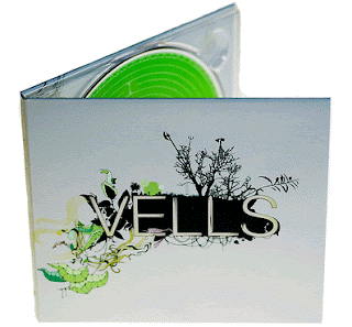
We like this because it is very simple and dull however it catches the eye because of the bold colour which stands out.
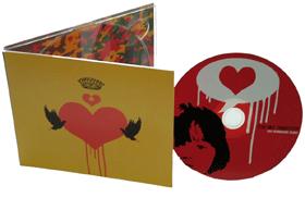
We liked this one because it conforms to our ideas it has a heart which is a convention of a love song, we also liked the idea that there is a picture on the cd. This gives you an insight into the genre of the song we liked this idea we also liked the idea that it doesn't have the performer on the cover which gives it some mystery.
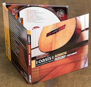
This is very simple and to the point. We didn't like this one too much we want to use it as an indication of what we don't want. We want our digipak to stand out. PIZAZ!

We like this because it is very simple and dull however it catches the eye because of the bold colour which stands out.

We liked this one because it conforms to our ideas it has a heart which is a convention of a love song, we also liked the idea that there is a picture on the cd. This gives you an insight into the genre of the song we liked this idea we also liked the idea that it doesn't have the performer on the cover which gives it some mystery.

This is very simple and to the point. We didn't like this one too much we want to use it as an indication of what we don't want. We want our digipak to stand out. PIZAZ!
Peer anaylysis
We would write feedback on the goodwin analysis, however there is not enough information to write comments on so we are just going to write a comment on our overall video.
Our music video includes typical love song conventions for example the subtle hearts in the background of the performers whenever they meet. They also seem very in love especially when they kiss at the end, there is usually a kiss in a love song.
There is a link between lyrics and visuals, the singer is lip syncing and it is in time with the visuals. There is also a story throughout the video which is based around the lyrics.
There is a link between the music and the visuals. The piano at the beginning matches the piano in the music. Also the pace of the video is slow like the pace of the music.
There are some close-ups of the performer singing which is a requirement for the record label. there sre not that many close-ups of the male singer however he is in most of the shots, he is not seen as the main performer.
The main characters look into each others eyes which demonstrates thier love. There is not any voyuerism however the two performers are looking back on their past from before they met.
There was a slight intextual reference to Daniel Powters video, Bad day. Because of the split screens. Also the song that we chose was writen for the film, Music and Lyrics.
Goodwin's Music Video peer Analysis
1. Yes, it's a soppy love song, girl and boy where love prospers in the end. There is a piano. Happily ever after theme. Well done!
2. Strong relationship between visuals and lyrics. There is lot of lip-syncing as well, but the boy seems reluctant to open his mouth too much.
3. Some relevance here. Piano playing at appropriate moments.
4. Some good motifs. Not enough close-ups. But there is a good one where she is doing the 4 screen make up thing. That's quality.
5. The 4 make up shot is like an inside look at the artists private world. Boy looking at camera when he shouldn't be.
6. Like a romantic comedy. Awkward love. which ends well. Real feel good
Well Done!
Labels:
Group 40
Monday, 16 November 2009
Last lesson of editing!!!
This is our last chance to edit our video at the beginning of the lesson we had a lot of work to do, there was a big gap towards the end of our video and it didn't seem like we had enough footage. In the end we decided to use some of our older footage and padded the video out with some useful footage that we got on our first day of filming. I am very pleased with the final music video all we have to do now is upload our video to the blog :)
Labels:
Sheridan
Thursday, 5 November 2009
New Shot: Together
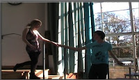
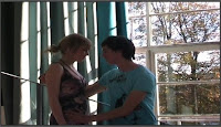
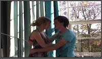
Pretty much the same as the kissing shots, the together shots link with the duet, being together, love type feel to the song so these shots are showing the audience that the narrative of the music video has gone full circle and all is well.
New shot: Kissing
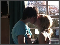
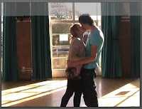
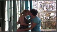
As our song is a love duet between two lovers, more romantic kissing shots have been taken with natural lighting creating the mood and idea of the natural love at first sight which is one of the points of our music video.
New Shot: On the steps
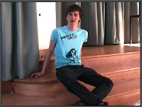
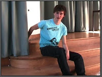
Also new shots of our character which are in different angles and more closer up making the video more of an duet instead of one main character and a back in singer. These shots are in the hall as well as the other new shots
New Shot: By the window
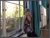
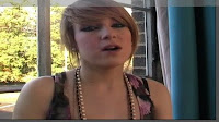
More shots of Sheridan in a completely different area by a window because of the feedback of the rough cut stating more close ups of the singer, so these shots have been placed within the music video.
New Shot: Piano
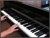
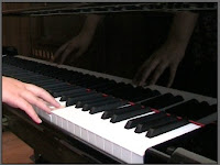
A new range of piano shot's for the final music video replacing the old piano shots because of the new range of angles and shots as well as a more attractive looking piano compared to the old one. this piano looks more proffesional and realistic in a music video it also fits this the conventions of our music video .
New footage
Yesterday we managed to get some good footage of the two different characters singing the whole track. We used the main hall to do this which looks really good with the big window in the background. It was really useful because there was a piano in hall which we could use and it looks much more professional than before.
We made sure that this time Callum and Sheridan showed more chemistry and we re filmed the kisses to make sure they look more romantic :)
We realised when watching back footage of Sheridan that there is a white board in the background so when editing we will try to get that out of the shot!!
Now we are going to upload the footage and put it into our original with better more professionally organized footage and editing.
When we have edited all the footage and if we are still not happy we can take the camera out again as we made sure not to use all our time just in case!
Wednesday, 4 November 2009
Extra filming...
After hearing what people thought of our video and from our own point of view, we want more strong lip syncing footage. Because most of the lip syncing has some laughing in we want to re-film Sheridan, Callum and the couple together lip syncing the whole song (maybe a couple of times if needed in different places).
Some people said that we shouldn't film in college (although about 90% of our footage is from outside of college) so when shooting our lip syncing we will try to find places that look completely different to what we already have.
The editing also needs some adjustments and we need to add the other shots such as the bus stop and cafe scene which we didn't have time to include in the rough cut. This should give more variety and a more obviously linked narrative.
When re-filming some scenes of the couple together we need to have more chemistry between the two, as some people didn't think they looked in love...
The beginning piano part will also need to be re-filmed as some people thought that it didn't match up or look real.
With some more strong footage to use and more editing we should be able to put right the things that people didn't like as well as make our video more professional.
Because people liked the heart symbol we put in different locations we want to use that more in our new footage. This would make our footage more unique and recognizable.
We hope to take the camera out for the day (4th November) and get everything we need so there is plenty of time for editing :)
Monday, 2 November 2009
Feedback
Teacher comments
Cinematography
*Well framed, but needs more close-ups of performer
Editing
*Piano dissolve at the beginning was effective
*More balance between performance and the story is needed
*Don't overuse shots
Mise en scene
*Appropriate to the genre
*Could do with more abstract or themed images to punctuate the other footage
Genre Convention
*Evidence of appropriate conventions
*Could use a usual motif or image to more symbolically represent the song
Whats missing?
*Needs more footage of the performer directly addressing the camera
Feedback...
Peer feedback:
Cinematography: Comments on standard and appropriacy of camera angles, movement and distance.
Good
*Lots of different shots; good shot variation
*Good shot variation and length-different shot types during singing together
*Split screens good
*Good establishing shots
Bad
*Mix it up at the end, gets a bit boring, shots too long.
Editing: comments on transition types, order and lip syncing.
Good
*Good use of split screens- makes it interesting
*Good standard of editing, always in sync with the tune.
Bad
*Could use different shots at the end
*Some of the shots were too long
*Too many fades
Mise-en-scene: comments on locations, costumes, props etc. Appropriate to genre?
Good
*Nice use of locations; makes you want to continue watching
Bad
*Change kiss at the end- awkward, boy looked nervous
*Piano doesn't fit with music
*Change the location from college
*No story, no middle; how did they actually meet?
Genre conventions: use of other genre conventions, What are they? Are they appropriate to the genre of music?
Good
*Typical 'love' story conventions
*Very focused on the two characters
*Like the hearts in location
Bad
*No chemistry
Next Step
Through editing our rough cut and looking back on our footage we feel that when we need more of is close up shots of the singer. We need more lip syncing and a fill shot of the whole song with each character singing throughout.We have also found that in some bits of our rough cut we have had to use the same shot for a long time so it would be better if we have a more variety of shots. We think that the best day would be Wednesday as most of us are free for a long period of time so we can make sure we get enough footage!

Wednesday, 21 October 2009
Callum Getting Ready
Wake Up Sheridan And Callum!
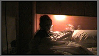
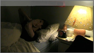
Both characters in different beds waking up giving a type of introduction to the narrative of the song just like other music videos introducing their characters and it also links characters together, getting up at the same time hints towards they are going to meet each other some time which makes these shots pretty deep about characters, if they don't look happy could also be linked with *Love*
Getting Ready Shots
Cafe Shots, Apart And Together
Bench Shots
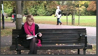
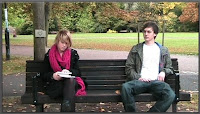
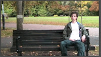
These bench shots are also taken within the Cambridge green, where both characters are sitting on the bench not noticing one another, with the heart on the tree just like the bus stop window, it makes it look like they keep bumping into each other by accident but it feels like fate for the audience watching
Bus Stop Shot
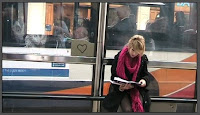
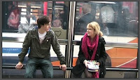
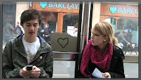
These shots are taken in Cambridge city center where they notice each other but not the heart in the background on the bus stall's window making it like a subliminal message which carry's out throughout the music video its a good shot because of the busy street and buses going past, creates a busy atmosphere within the music video which is challenged with the whole park shot which is empty.
Together Tree Shots
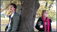
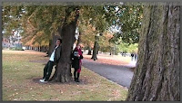
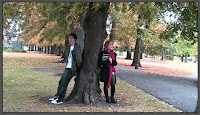
In these shots it is still an open environment but both characters on different side of the tree's we are making these split screens to show they aren't in the same shot but it hints he is what Sheridan is looking for which is also backed up with the chorus singing together, they are also different shots giving an overall view of the background.
Sheridan Chorus Shots
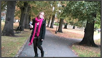
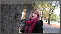
Sheridan shot in a Cambridge green, walking down a long walk way as well as singing by a tree, the big open space with very few people in it showing Sheridan hasn't yet found what she is still looking for that some thing
Walking Shots
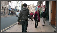
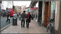
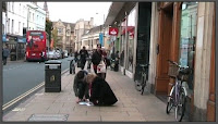
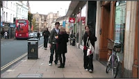
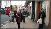
Shots taken in Cambridge town center of both characters bumping into each other, this was taken is a busy street so if people look at the camera there isn't much that we can do but its makes a good shot because when they are picking up books people are walking past and it makes it more real rather than a fake set.
Monday, 19 October 2009
Sheridan And Callum In Studio Shots
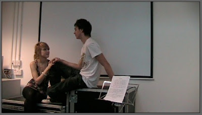
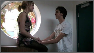
These shots are nearer the end of the song where both characters have moved into the *studio* which is also the music room when both characters have found each other and it becomes more of a love duet song because they found what they were looking for, each other.
Window Shots
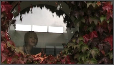
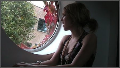
In these two screen shots you can see the window and leaves as well as Sheridan, we shot Sheridan looking out of the window then decided to shoot another part of her with the camera outside looking in on Sheridan. This was also shot in the music room next to the piano that you cant see.
These shots work well because they show Sheridan looking out for some thing or someone, which could be love working well with the love theme of the song.
Studio Shots
Studio shots were also taken in the music room but in a different area of the room on music box's giving the hole studio feel and look, the plain white wall keeps the audience interested in Sheridan, so people don't loose interest in her and look at objects in the background


